Scatterplot Display#
At a Glance
Parameters: Up to 5 XYZ sets
Modes: 2D (XY) or 3D (XYZ with colour mapping)
Key Features: Best-fit lines, zoom box, colour mapping
Best For: Correlation analysis, efficiency maps, calibration maps
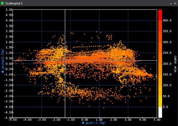
The Scatterplot is a two-dimensional (X-Y) plot of one parameter against another, optionally colour-mapped by a third Z parameter. It's designed to reveal relationships and trends across sessions, with controls for sampling density, draw style, best-fit curves, and engineering reference lines. Up to five parameter sets can be shown in one display.
When to Use Scatterplot Display#
 Correlation analysis: See how two parameters relate to each other
 Map creation: Create torque maps, efficiency maps, calibration maps
 Pattern identification: Spot trends and clusters in data
 Multi-parameter relationships: Visualise three parameters simultaneously with colour mapping
 Comparison: Plot multiple parameter sets to compare behaviour
Adding a Scatterplot Display#
To add a Scatterplot Display to a page, use one of the following methods:
- Toolbar: Click the Scatterplot Display button on the Display Toolbar.
- Menu: Go to File > New > Display and select Scatterplot Display.
- Shortcut: Press
Ctrl+Qtwice to open the QuickAccess Assistant, type "Scatterplot", and select New Scatterplot Display. - From Waveform: Select two parameters in a Waveform legend and use View Scatterplot of Selected Parameters (
Ctrl+T) to create a Scatterplot pre-wired to those signals.
A third "Z" parameter can be selected to create a three-dimensional scatter plot.
Adding the Z-axis#
- Press
Pon the display to open parameter configuration. - Click the Use Z Axis box.
- Select the parameter from the list.
- The Z-axis is scaled using a colour bar on the Scatterplot display.
Display Anatomy#
- Plot Area: Shows data points
- X-Axis: Horizontal axis (first selected parameter)
- Y-Axis: Vertical axis (second selected parameter)
- Colour Bar: Shows Z-axis mapping (if 3D mode)
- Grid: Optional grid overlay
- Best-Fit Lines: Optional trend lines
- Zero Axes: Optional reference lines at X=0 and Y=0
Key Features#
2D and 3D Plotting#
2D Mode (X vs Y):
- Plot one parameter against another
- Points coloured by parameter or fixed colour
- Simple correlation analysis
3D Mode (X vs Y vs Z):
- Third parameter mapped to point colours
- Colour bar shows Z-value scale
- Visualise three dimensions simultaneously
Multiple Parameter Sets#
Add up to 5 different XY or XYZ parameter sets:
- Each set plots as separate series
- Different colours per set
- Compare different parameter relationships
- Independent best-fit lines per set
Colour Mapping#
When using Z-axis (3D mode):
- Points coloured by Z-value
- Colour bar shows value-to-colour mapping
- Customise colour scale
- Adjust colour range
Draw Styles#
Choose how data points appear:
- Points (dots)
- Lines connecting points
- Points with connecting lines
- Filled shapes
Grid Configuration#
Grid Size Options:
- Small: Fine grid for detailed work
- Medium: Balanced grid spacing
- Large: Coarse grid for overview
- Custom: Specify exact spacing
Grid Display:
- Show/hide major gridlines
- Show/hide minor gridlines
- Custom grid colours
- Adjust grid opacity
Zoom and Navigation#
Zoom Box:
- Click and drag to create zoom region
- Automatically zooms to selected area
- Undo/redo zoom with toolbar buttons
Zoom History:
- Multiple zoom levels remembered
- Navigate back/forward through zoom history
- Reset to full view
Manual Scaling:
- Set exact X and Y axis ranges
- Auto-scale to data
- Lock aspect ratio (optional)
Cursor Modes#
Value Mode: Standard cursor
Crosshair Mode: Adds horizontal and vertical reference lines
In-Place Reference Line: Fixed reference marker
Best Fit & Reference Lines#
Opening the Editor#
- Right-click the Scatterplot and choose Edit Best Fit and Reference Lines....
- The editor lists all current lines with X/Y parameter binding, type (Best Fit or Reference), formula (for Reference Lines), and specified order (for Best Fit).
Best Fit Lines#
- Polynomial fit up to 5th order.
- Order:
- Unspecified: ATLAS automatically selects the most accurate polynomial order (up to 5).
- Specified (1-5): Forces that exact order (e.g., 1 = linear).
- Limits: Define which samples are used for the fit (do not clip the drawn line). The calculated line spans the entire plot area.
- Colour & Sessions: Line colour defaults to the set's colour. In compare mode, each Best Fit line is recalculated per session and uses the session colour. Custom colours apply only in single-session mode.
Fit Types Available:
| Type | Use Case | Formula |
|---|---|---|
| Linear | Straight relationships | y = mx + b |
| Polynomial | Curved relationships | y = aₓxⁿ + ... + a₁x + a₀ |
| Power | Power law | y = axᵇ |
| Exponential | Growth/decay | y = aeᵇˣ |
| Logarithmic | Log relationships | y = a ln(x) + b |
Formula Display
Enable Show Formula to display the equation with coefficients near the line. Updates when data changes!
Reference Lines#
- Explicit formula: Supply coefficients for
Y = f(X). Use Auto Calculate to fill coefficients from the current sample set. - Limits: Define where the line is drawn (limits do clip the rendered extent).
- Colour: Reference line colour is retained across sessions — one line per scatterplot.
Placing a Linear Reference Line (Interactive)#
- Choose Place Linear Reference Line from the right-click menu.
- A temporary white line with drag handles appears:
- Drag centre to move; drag ends to pivot and stretch.
- Confirm to persist the line, then select which scatterplot set to apply it to.
- X/Y axis limits are inferred from handle positions. Changing the selected set updates coefficients and limits; manual tweaks are lost if you switch sets again.
Line Lifecycle & Visibility#
- Automatic deletion: Lines are tied to specific X/Y parameter pairs. Deleting X or Y, swapping axes, or replacing Z with X or Y deletes associated lines without warning. Undo does not restore them.
- Global toggles:
- Show Best Fit and Reference Lines (on/off for all lines).
- Show Best Fit Line Formulas (shows formulas under the X-axis).
- Per-line or per-set visibility toggles are not available.
Lines and Parameter Changes
If lines disappear after changing parameters, remember that changing X/Y (or swapping with Z) auto-deletes associated lines. Recreate them after the change.
Scatterplot Sampling Modes#
In the ATLAS Scatterplot, there is a selection of different Data Point Modes. The different Data Point Mode selection alters the way in which the X, Y (and Z) samples are calculated for plotting co-ordinates on the scatterplot.
These can be accessed via the Display Properties Window for the Scatterplot.
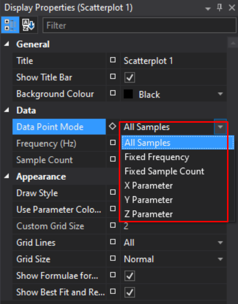
There are 6 different modes, each illustrated below with a worked example:
- All Samples
- Fixed Frequency
- Fixed Sample Count
- X Parameter
- Y Parameter
- Z Parameter
This mode setting applies at a display level, so any plots within that display inherit these properties.
All Samples Mode#
ATLAS 10.4.1 and later
Note
In this mode, the Frequency (Hz) and Sample Count fields are ignored and read only.
All Samples mode operates by taking each sample of the highest rate parameter, and referencing the sample and hold values of the other parameter(s). There is no averaging of samples, and only real values will be plotted.
If the X Parameter is logged at 100Hz, and the Y at 10Hz, the Y parameter will effectively be super-sampled at 100Hz in order to plot a point for each X parameter sample. If super-sampling is not desired, we recommend creating a function(s) which down-samples parameters where required, such that X, Y (and Z) are all at the same rate.
Example
| Time | X Parameter Value (Blue) 2Hz |
Y Parameter Value (Red) 1Hz |
X Co-ordinate plotted |
Y Co-ordinate plotted |
|---|---|---|---|---|
| 0.0 | 0 | 4 | 0 | 4 |
| 0.5 | 1 | 1 | 4 | |
| 1.0 | 2 | 2 | 2 | 2 |
| 1.5 | 3 | 3 | 2 | |
| 2.0 | 4 | 0 | 4 | 0 |
| 2.5 | 5 | 5 | 0 |
X, Y, Z Parameter#
ATLAS 10.4.3 and later
ATLAS 10.4.3 introduced 3 new modes in the scatterplot: X, Y and Z Parameter.
These work in a similar manner to All Samples mode — however instead of inferring the highest rate parameter and using that to look up corresponding values on the other axes, the user can specify explicitly whether the X, Y or Z parameter is used as the "master".
Example: X Parameter
For every sample of the X Parameter, a corresponding value of Y (or Z) is referenced regardless of the rate of these parameters:
| Time | X Parameter Value (Blue) 2Hz |
Y Parameter Value (Red) 1Hz |
X Co-ordinate plotted |
Y Co-ordinate plotted |
|---|---|---|---|---|
| 0.0 | 0 | 4 | 0 | 4 |
| 0.5 | 1 | 1 | 4 | |
| 1.0 | 2 | 2 | 2 | 2 |
| 1.5 | 3 | 3 | 2 | |
| 2.0 | 4 | 0 | 4 | 0 |
| 2.5 | 5 | 5 | 0 |
Example: Y Parameter
For every sample of the Y Parameter, corresponding samples of X (or Z) are referenced:
| Time | X Parameter Value (Blue) 2Hz |
Y Parameter Value (Red) 1Hz |
X Co-ordinate plotted |
Y Co-ordinate plotted |
|---|---|---|---|---|
| 0.0 | 0 | 4 | 0 | 4 |
| 0.5 | 1 | |||
| 1.0 | 2 | 2 | 2 | 2 |
| 1.5 | 3 | |||
| 2.0 | 4 | 0 | 4 | 0 |
| 2.5 | 5 |
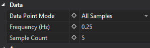
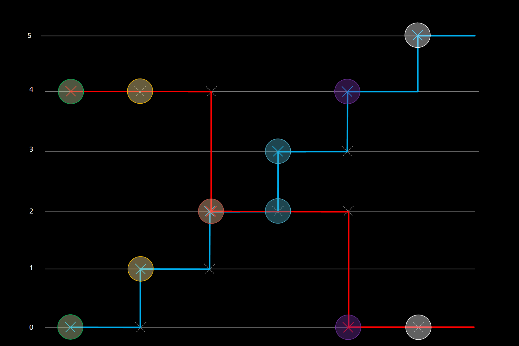
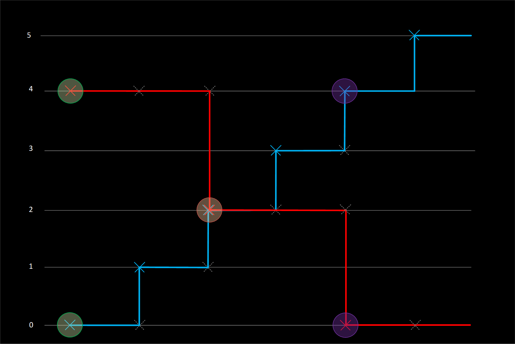
Fixed Frequency and Fixed Sample Count Modes#
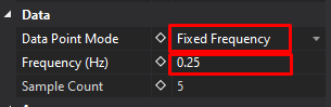
Fixed Frequency mode reads the Frequency (Hz) field, but ignores Sample Count.
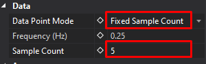
Fixed Sample Count mode reads the Sample Count field, but ignores Frequency (Hz).
Fixed Frequency & Fixed Sample Count modes calculate samples to plot in a very similar way. Both of these modes calculate a Time Period and then plot averages of X, Y or Z parameters over that Period.
- If a Period only spans a single sample, then the real sample value will be used;
- If the Period spans multiple samples, then those samples will be averaged.
The only difference between the modes is how the Time Period is calculated.
Fixed Frequency Period Calculation
Fixed Frequency Sample Time Period is set by a frequency.
Time Period = 1/Frequency (Hz)
If the Frequency is set to 0.25Hz, then the Time period will be 4 seconds (1/0.25).
Fixed Sample Count Period Calculation
Fixed Sample Count Time Period is set by splitting up the Display Time range, into a number of samples.
Time Period = Display Time Range / Number of Samples
If the Display Time range is displaying 20 seconds of data (can be changed by Zoom Level), and the Number of Samples is set to 5, then the Time Period will be 4 seconds (20/5).
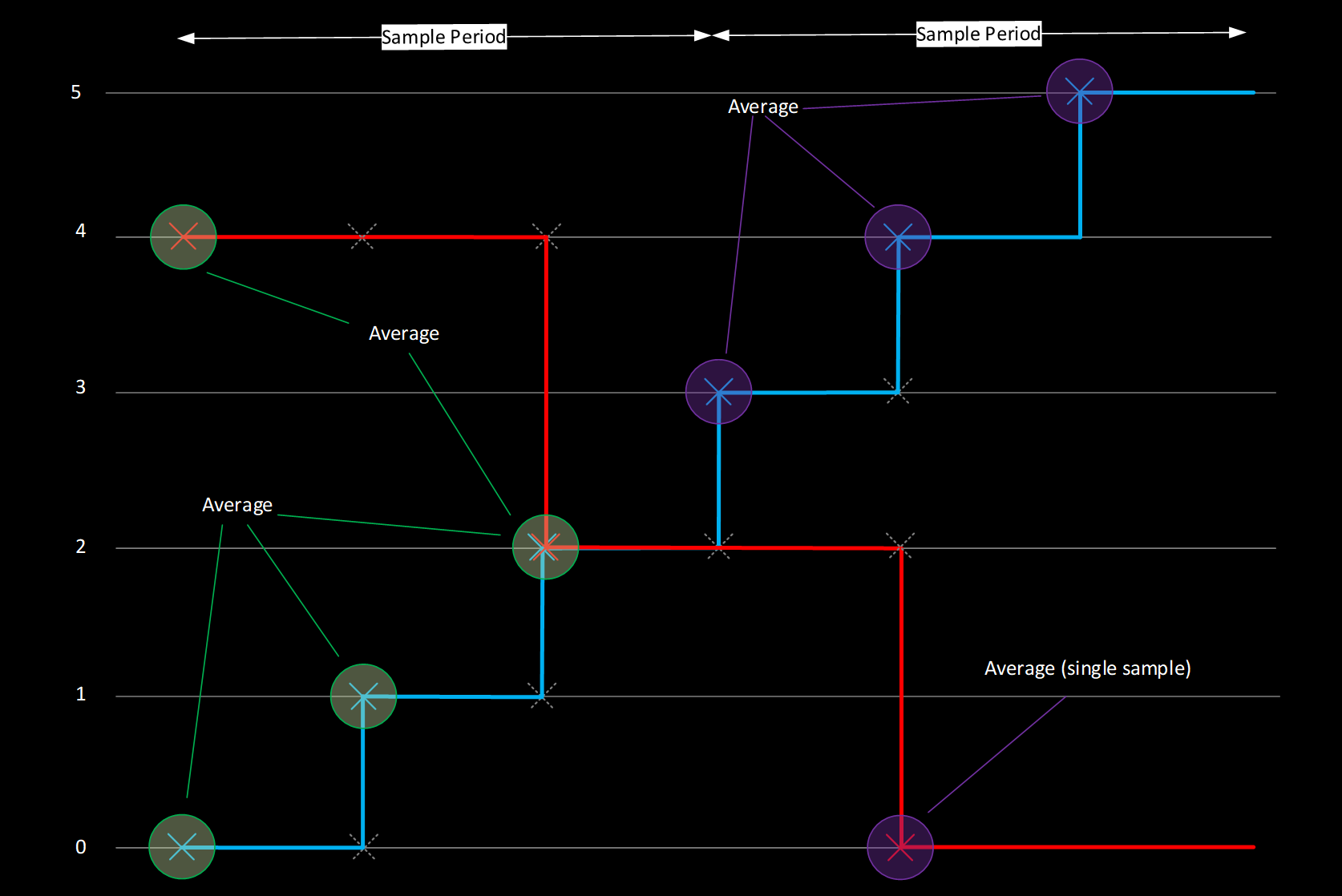
Example: Fixed Frequency & Fixed Sample Counts
| Time | X Parameter Value (Blue) 2Hz |
Y Parameter Value (Red) 1Hz |
X Co-ordinate plotted |
Y Co-ordinate plotted |
|---|---|---|---|---|
| Sample Period 1 0-1.5 Seconds |
0 | 4 | (0+1+2) / 2 = 1.5 | (4+2) / 2 = 3 |
| 1 | ||||
| 2 | 2 | |||
| Sample Period 2 1.5-3.0 Seconds |
3 | (3+4+5) / 2 = 6 | 0 | |
| 4 | 0 | |||
| 5 |
In the example above, Sample Period of 1.5 seconds could be achieved in both Fixed Frequency or Fixed Sample Count:
Time Period (Fixed Frequency) = 1 / 0.667Hz
Time Period (Number of Samples) = 6 (seconds on display) / 2 (samples)
Display Properties#
Data Configuration#
- Fixed frequency (Hz)
- Fixed sample count
- Data point mode (see Sampling Modes)
- Show Z-axis colour mapping
Grid Settings#
- Grid size (Small/Medium/Large/Custom)
- Custom grid spacing
- Show major gridlines
- Show minor gridlines
- Grid colour
Visual Options#
- Primary draw style
- Show boundary lines (best-fit)
- Show zero axes
- Show best-fit formulas
- Show colour bar (3D mode)
- Background colour
Axes#
- X-axis label and range
- Y-axis label and range
- Z-axis label and range (3D)
- Auto-scale options
- Lock aspect ratio
Working with Parameters#
Adding Parameter Sets#
- Add X-axis parameter (first)
- Add Y-axis parameter (second)
- (Optional) Add Z-axis parameter (third)
- Repeat for additional parameter sets (up to 5)
Editing Parameter Properties#
Double-click axis label or parameter to configure:
- Parameter selection
- Colour assignment
- Scale and range
- Units display
- Decimal precision
Removing Parameters#
- Select parameter set
- Press
Deleteor right-click > Remove
Keyboard Shortcuts#
| Key | Action |
|---|---|
D |
Display Properties |
P |
Parameter configuration |
Z |
Zoom box mode |
Ctrl+Z |
Undo zoom |
Ctrl+Y |
Redo zoom |
Home |
Reset zoom |
Ctrl+T |
View Scatterplot of Selected Parameters (from Waveform) |
Delete |
Remove selected parameter set |
Example Use Cases#
Create an engine torque map:
- Add Scatterplot Display
- X-axis: Engine RPM
- Y-axis: Throttle Position
- Z-axis: Engine Torque (colour mapped)
- Enable colour bar
- Adjust grid for readability
- Set appropriate axis ranges
 Result: Visual map of torque across RPM and throttle
Analyse parameter relationships:
- Add parameters to analyse (X vs Y)
- Add linear best-fit line
- Enable "Show Formula"
- Look for strong correlation (tight to line)
- R² value indicates correlation strength
Result: Quantify relationship between parameters
Find efficient operating zones:
- X-axis: Speed
- Y-axis: Power
- Z-axis: Fuel consumption (colour)
- Identify efficient zones (cooler colours)
- Spot inefficiencies (warmer colours)
 Result: Optimise performance and efficiency
Tips & Tricks#
Getting Started
 Start simple: Begin with 2D, add Z-axis when needed
:grid: Grid sizing: Use Custom grid for specific map resolutions
Colour scales: Adjust Z-axis range to enhance colour contrast
Analysis
Zoom in: Work at appropriate detail level for analysis
Best-fit lines: Use to quantify relationships numerically
Multiple sets: Compare different sessions or laps
 Save templates: Save scatterplot configurations for repeated use
Performance
If the plot feels cluttered, reduce density via Fixed Sample Count or switch Draw Style to Small Point or Cross.
If Z-colouring appears sparse, check the Z limits (Parameter Properties > Appearance > Limits). Points with Z outside limits are not drawn.
To focus on part of the lap/run, set a Reference Cursor on a Waveform and use the Scatterplot's solid/faint point effect to isolate that window.
Troubleshooting#
No data points showing?
- Check parameters are added correctly
- Verify session is loaded
- Check axis ranges include data
- Try auto-scale
Points too dense to see pattern?
- Use fixed frequency mode to thin data
- Zoom into specific regions
- Adjust point draw style
- Enable best-fit line to see trend
Colour bar not showing?
- Verify Z-axis parameter is added
- Check "Show colour bar" is enabled
- Check Z-parameter has valid data
Best-fit line incorrect?
- Check fit type is appropriate for data
- Try different polynomial degree
- Verify sufficient data points
- Check for outliers affecting fit
Zoom stuck?
- Press
Hometo reset zoom - Use undo zoom (
Ctrl+Z) - Check manual axis ranges
Lines disappeared after parameter change?
- Lines are tied to specific X/Y parameter pairs
- Deleting X or Y, swapping axes, or replacing Z with X or Y deletes associated lines without warning
- Undo does not restore them — recreate the lines after the change